

Animated themes can make a Galaxy phone feel more alive, but motion works best when it supports one clear visual idea. If the wallpaper, icons, and animation all compete for attention, a theme that looks charming in a preview can become tiring during daily use.
Start with one clear focal point
Simple Clover Animated is a useful example. Its verified catalog description centers on a minimalist watercolor potted plant and butterflies. The cream background, green clover, and small pink accent give the design an obvious visual hierarchy without filling every part of the screen.
When you preview any animated Samsung theme, watch the full cycle twice. The first viewing tells you whether the motion is attractive. The second tells you whether your eyes can still rest on the clock, app labels, and notifications.
Check more than the wallpaper
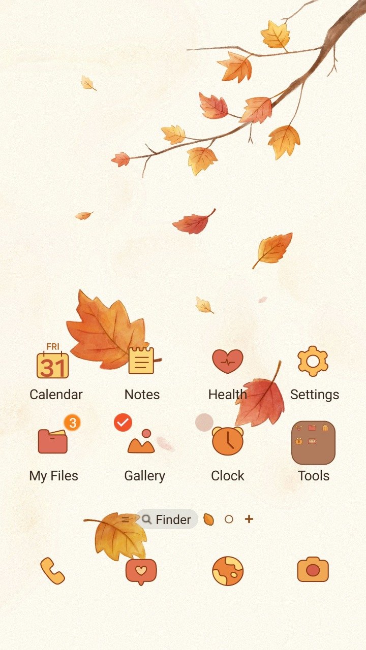
A theme is a complete interface, so check the parts you touch most often:
- App labels should stay easy to read against the wallpaper.
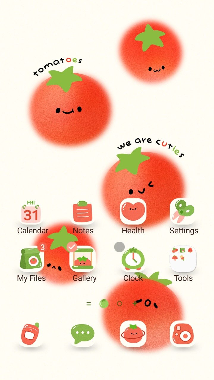
- Icons should be distinct enough to recognize quickly.
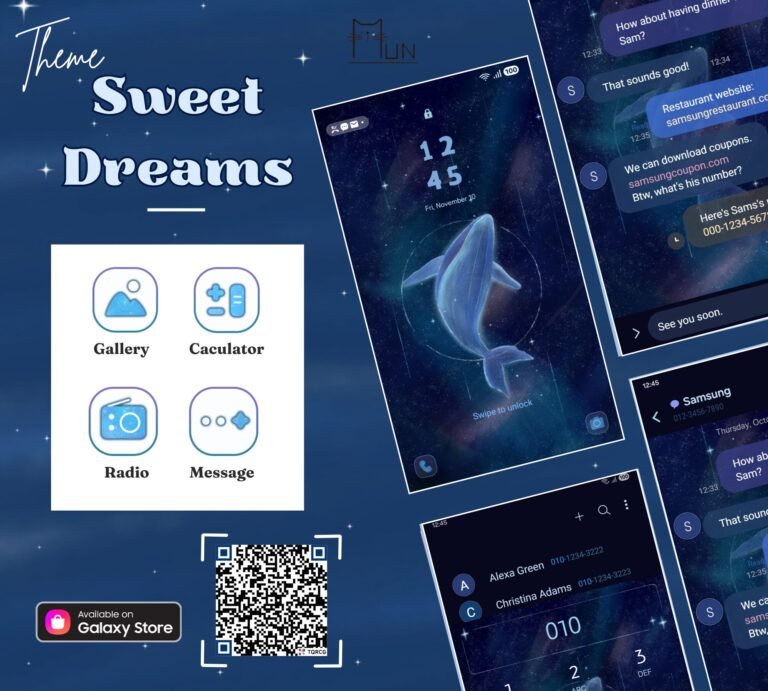
- Lock Screen text and notification cards should have clear contrast.
- Frequently used buttons should not disappear into decorative colors.
If the store preview includes several screens, compare them instead of judging the theme from the hero image alone.
Use motion where you naturally pause
Subtle animation feels calm when it sits near a focal point you already look at, such as the central illustration or Lock Screen clock. Strong movement across the whole background can make icons harder to scan. A simple design gives the animation room to work without becoming visual noise.
Test the palette in bright and dim light
Soft cream and pastel colors can look comfortable indoors, but pale app labels may be harder to read in sunlight. Darker themes have the opposite problem when several black or deep gray elements merge together. Before settling on a theme, check it in the lighting where you use your phone most often.
Match KakaoTalk only when the hierarchy stays clear
Simple Clover Animated also has a free matching KakaoTalk theme. Matching the Home Screen and messenger can create a more consistent look, but the chat list, message bubbles, and bottom navigation still need to remain easy to distinguish.
A quick checklist before you apply
- Watch the complete animation cycle.
- Read several app labels without zooming in.
- Check the Lock Screen clock and notifications.
- Preview both the Home Screen and app drawer.
- If you use a matching chat theme, inspect message contrast separately.
The calmest animated themes usually make one element feel alive while leaving the rest of the interface easy to use. Start with the focal point, then let readability decide whether the theme belongs on your phone every day.