How to Choose a Samsung Theme That Stays Easy to Read
 SophieSeptember 27, 2026
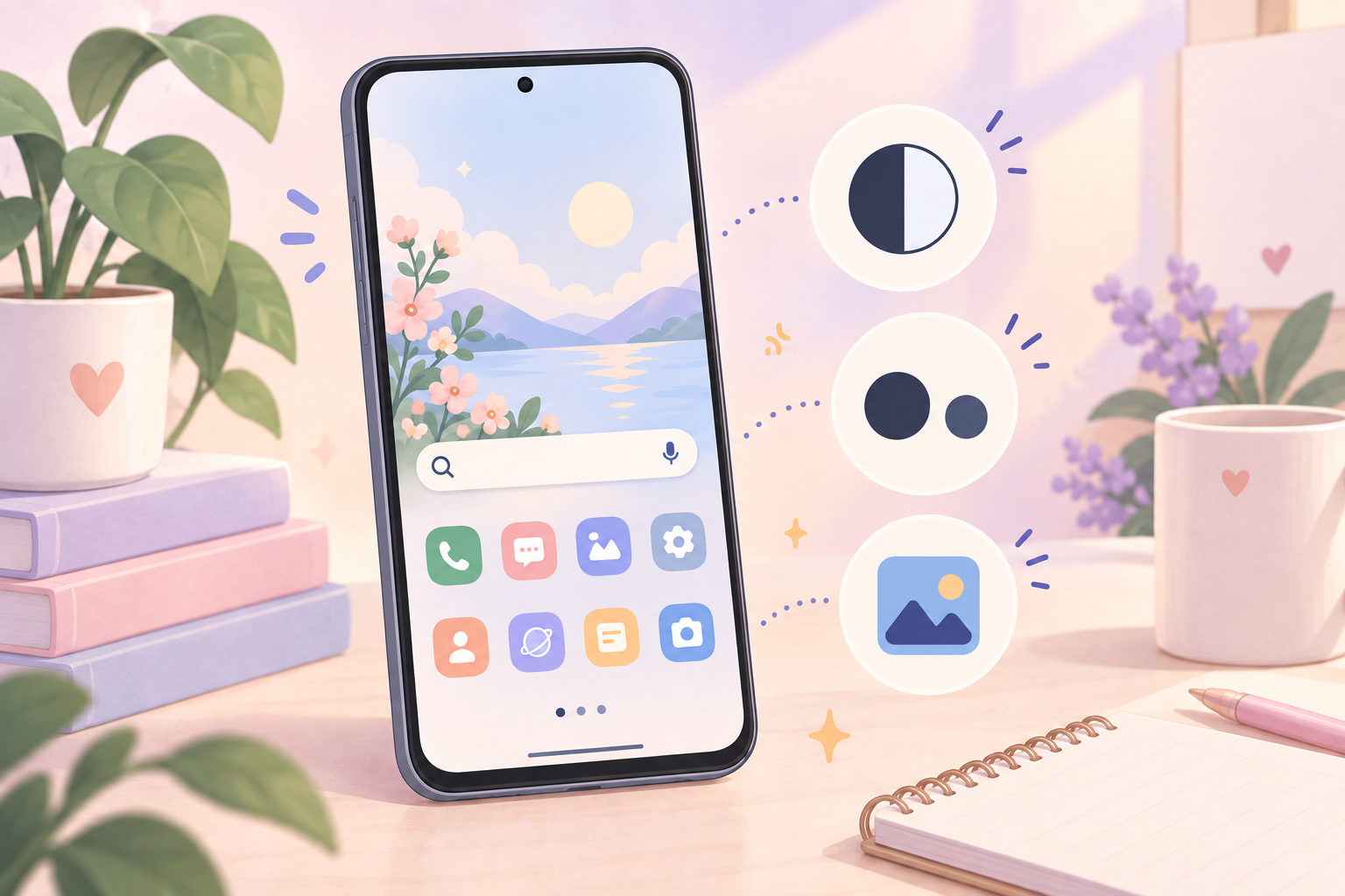
Start with the screens you use most
A Samsung theme can look beautiful in a store preview and still feel tiring after a full day. Wallpaper, icons, colors, and sometimes fonts all compete for attention, so the best theme is not only the cutest one. It is the one you can read without effort.
Before you tap Apply, use this short checklist. Menu names can vary slightly by Galaxy model and One UI version.
Check the wallpaper behind real content
Look past the empty preview. Imagine app labels, widgets, notification text, and the clock sitting on top of the wallpaper.
A detailed illustration is often easier to use when its busiest area stays away from the middle of the Home screen. On the Lock screen, check that the clock remains clear in both bright and dark parts of the image.
If a wallpaper is the part you love most, you can often apply the wallpaper separately instead of changing the whole theme.
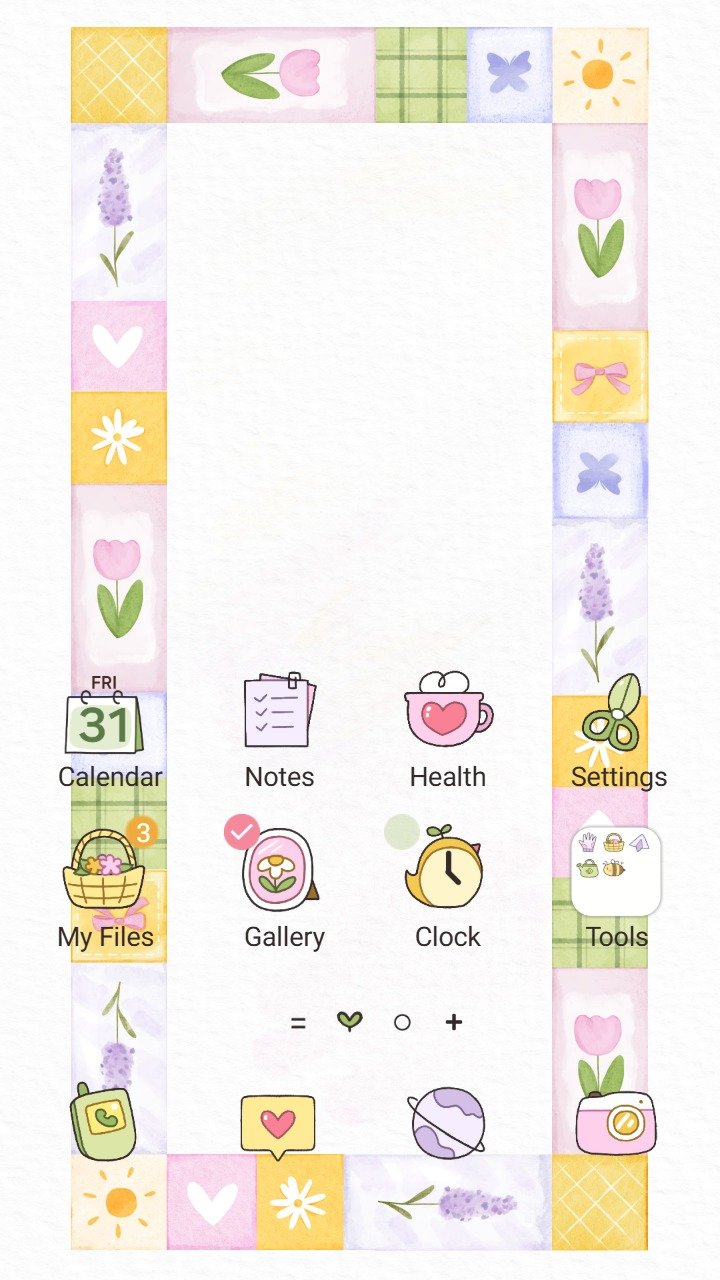
Inspect the icons at normal size
Tiny icons need a clear silhouette. Open the preview that shows several icons together and ask three questions:
- Can I recognise Phone, Messages, Camera, and Settings quickly?
- Do the icons separate clearly from the wallpaper?
- Are similar apps easy to tell apart without reading every label?
Soft pastel colors can still be readable when the outlines and shapes are distinct. A busy background plus low-contrast icons is the combination most likely to slow you down.
Test text size before changing the theme
Your preferred font size is worth checking first. On most Galaxy phones, open Settings, choose Display, then Font size and style. Move the slider until menus and messages feel comfortable.
Samsung also offers accessibility options such as high-contrast fonts on supported devices. If you rely on those settings, keep them enabled while you preview a theme so the result matches the way you actually use your phone.
Preview both light and dark areas
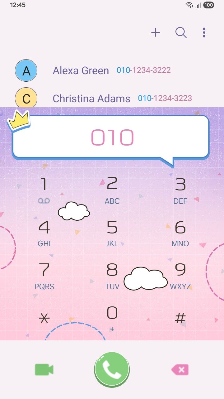
Some themes affect more than the Home screen. Colors can also appear in menus, notifications, the dialer, or Samsung apps, depending on the theme and your One UI version.
Check the preview for both bright and dark screens. Pay special attention to small secondary text, selected tabs, and notification buttons. Decorative colors should never make those controls hard to find.
Keep a simple way back
You do not need to remember every old setting. Samsung stores downloaded themes and components in Galaxy Themes under Menu and My stuff. From there, you can return to a previous item or select the default theme, wallpaper, or icons.
Knowing where My stuff is makes experimenting less stressful. Try a new look for an hour, open the apps you use most, and switch back if anything feels unclear.
Choose one strong idea
The easiest themes to live with usually have one visual focus: a soft landscape, a small character, a floral pattern, or a consistent icon style. When every surface competes for attention, the phone becomes harder to scan.
Browse the current Mun Studio Samsung themes and use the previews to compare wallpaper detail, icon contrast, and overall color balance before choosing one. The prettiest theme is the one that still feels effortless on the hundredth unlock.
For Samsung’s own instructions on previewing and managing themes, see the Galaxy Themes support guide.